Brand Identity
Website Design
Formwerks Architecture
Residential Real Estate
Deliverables:
Brand Identity
Brand Identity
Website Design
Website Design
Art Direction
Art Direction
Recognition:
From the client:
Position a six-home boutique multiplex within Vancouver's competitive West Side market, where four-bedroom family ownership has become increasingly scarce.
The project required a brand identity that could authentically engage multiple distinct buyer personas families upgrading from condos, multi-generational households, strategic investors, and West Side downsizers without compromising premium positioning or cultural resonance.
Key Business Challenges:
Differentiate boutique scale in a market dominated by large developments
Communicate luxury accessibility across diverse cultural backgrounds
Balance contemporary architectural language with family-centered values
Create emotional connection while maintaining investment credibility
Analyzed Vancouver's West Side demographic transformation: accelerated demand for family-sized homes driven by condo market maturation, multi-generational household growth, and restricted four-bedroom supply.
Identified the strategic tension: buyers seeking premium quality at attainable scale, contemporary design honoring traditional family values, and architectural sophistication that feels inclusive rather than exclusionary.
Developed positioning centered on "attainable luxury at human scale"—a narrative bridge between boutique craftsmanship and family accessibility.
Established visual principles:
Organic geometry suggesting connection over transaction
Refined execution signaling premium quality
Warm materials grounding contemporary aesthetics
Spatial generosity reflecting the homes' proportional design
Brand Positioning:
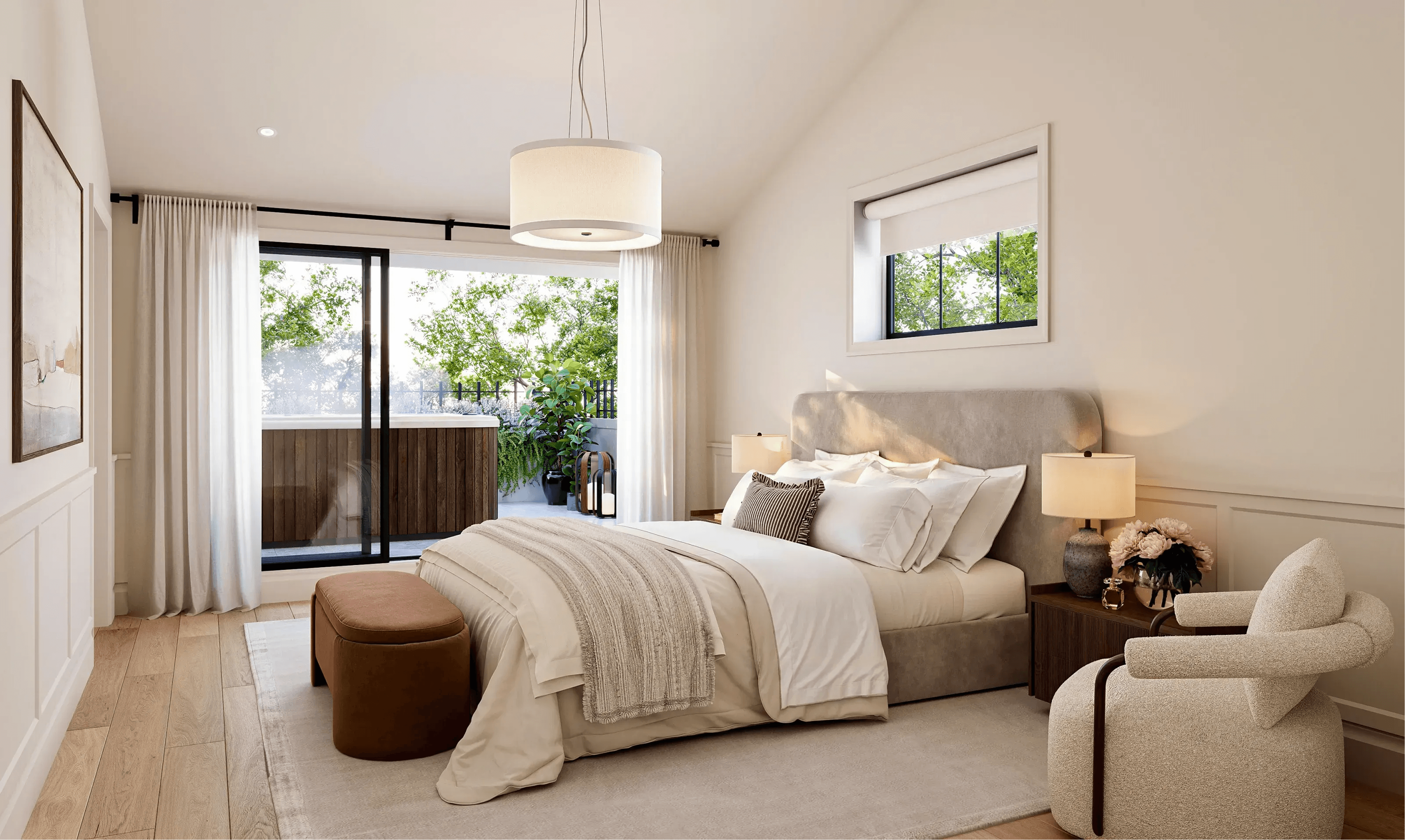
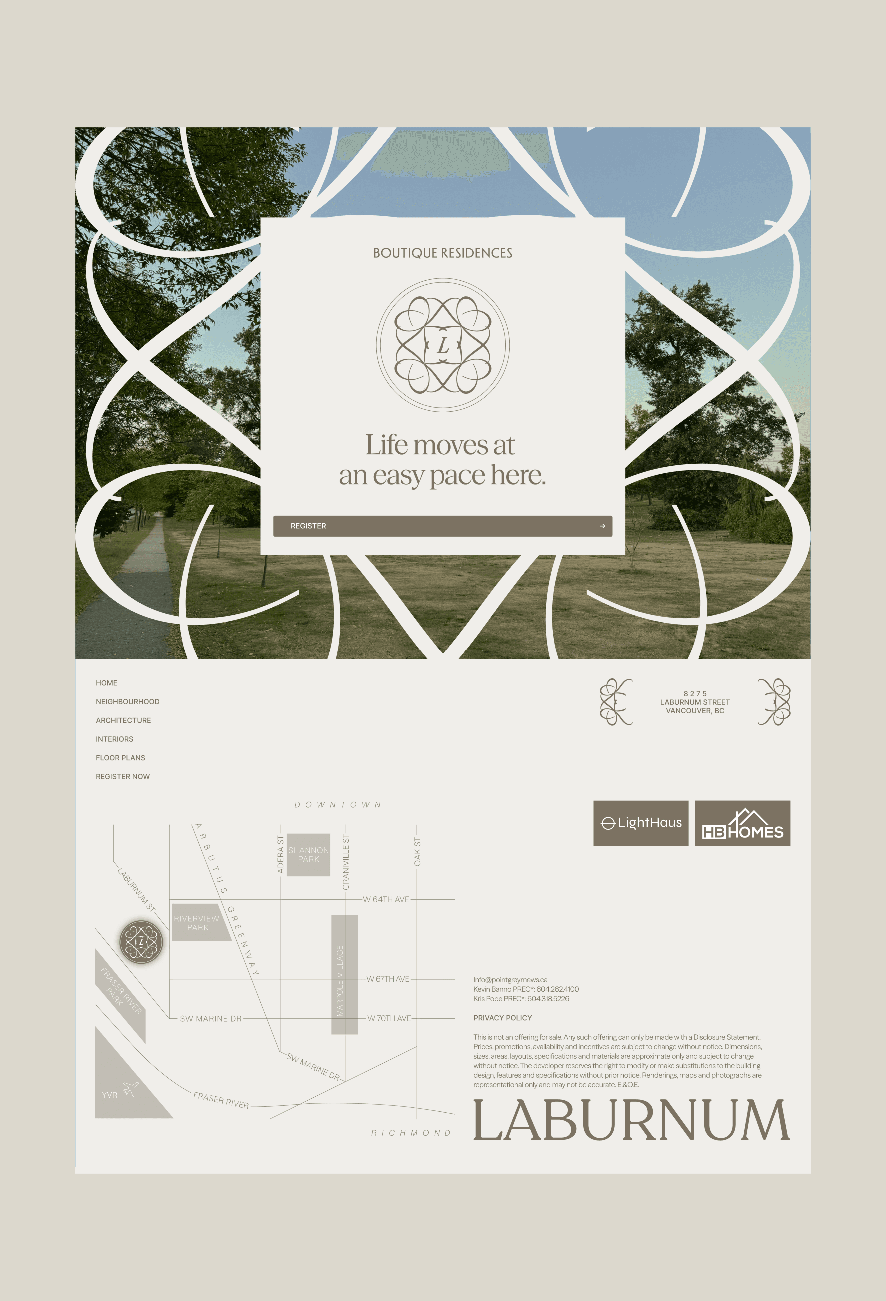
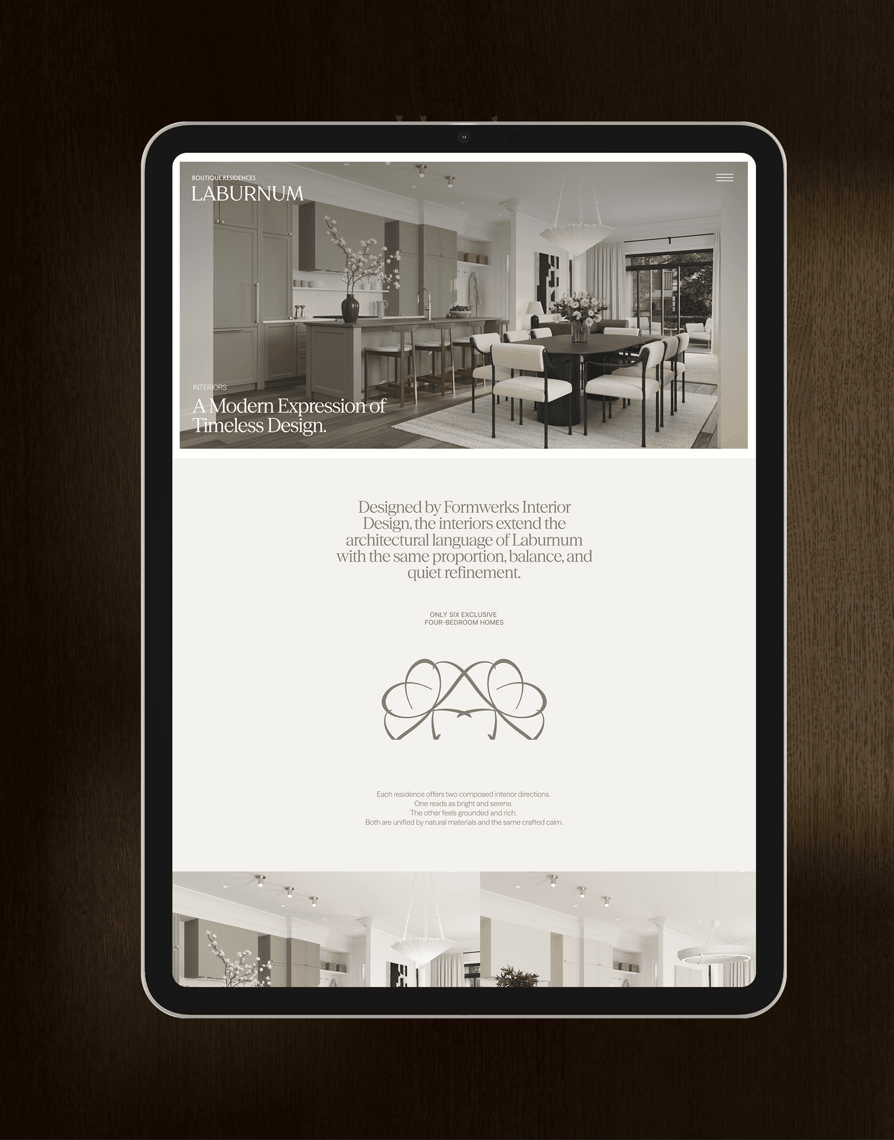
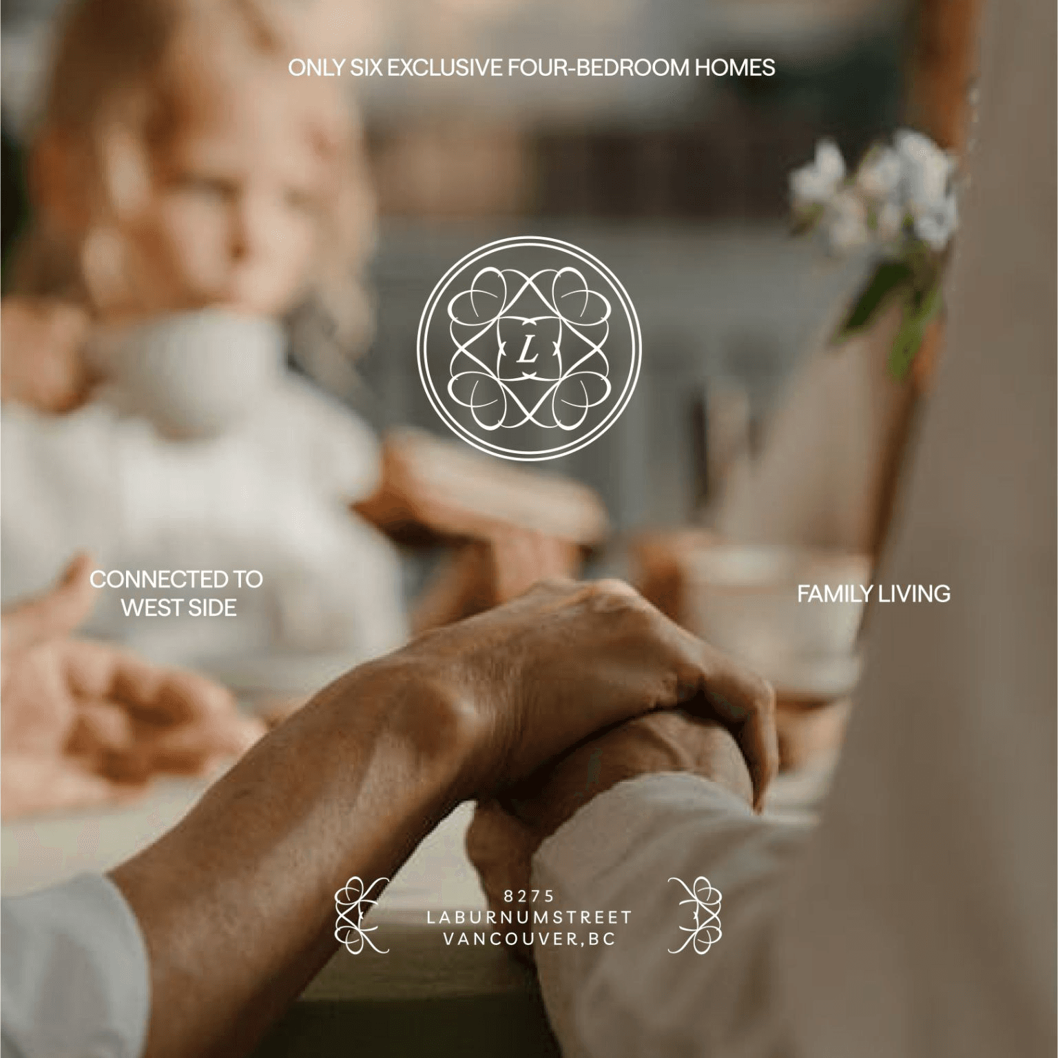
Six rare four-bedroom homes in Marpole's heart—designed for family-centered living, boutique intimacy, and West Side connectivity.
Visual Identity:
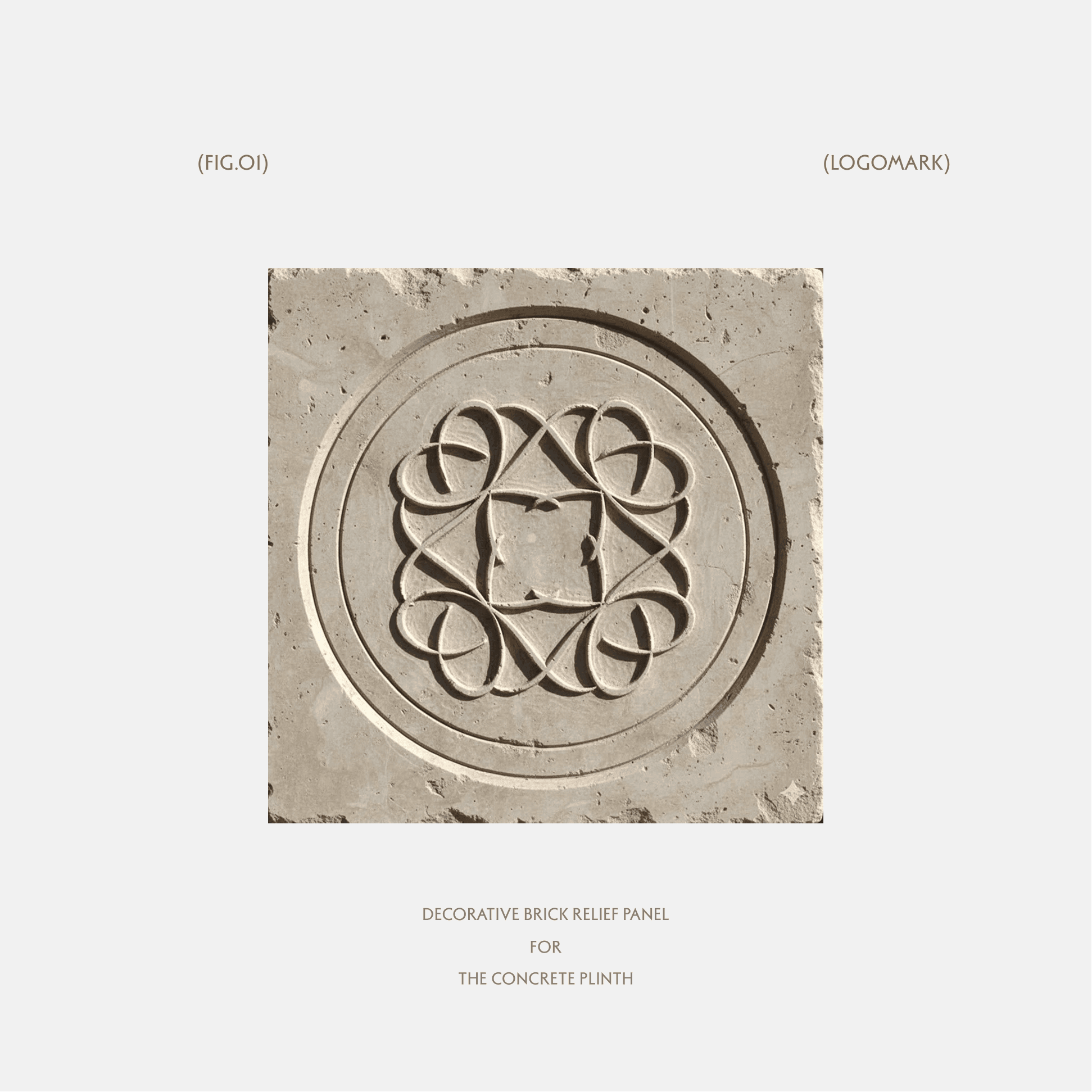
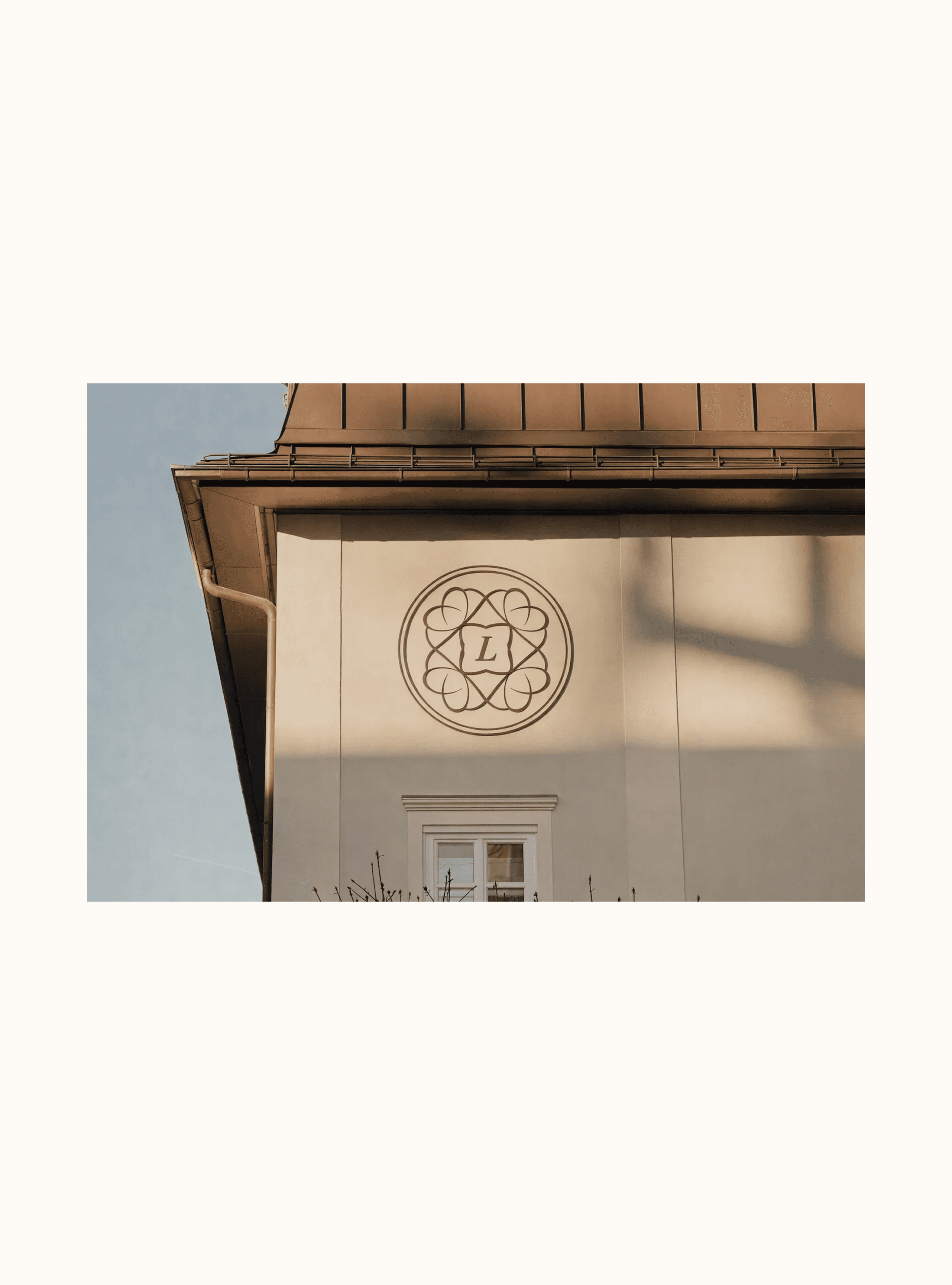
The interlocking "L" mark serves as both rational signifier (four bedrooms) and emotional anchor (family connection), creating a symbol that operates across cultural contexts while maintaining premium aesthetic standards.
Digital Presence:
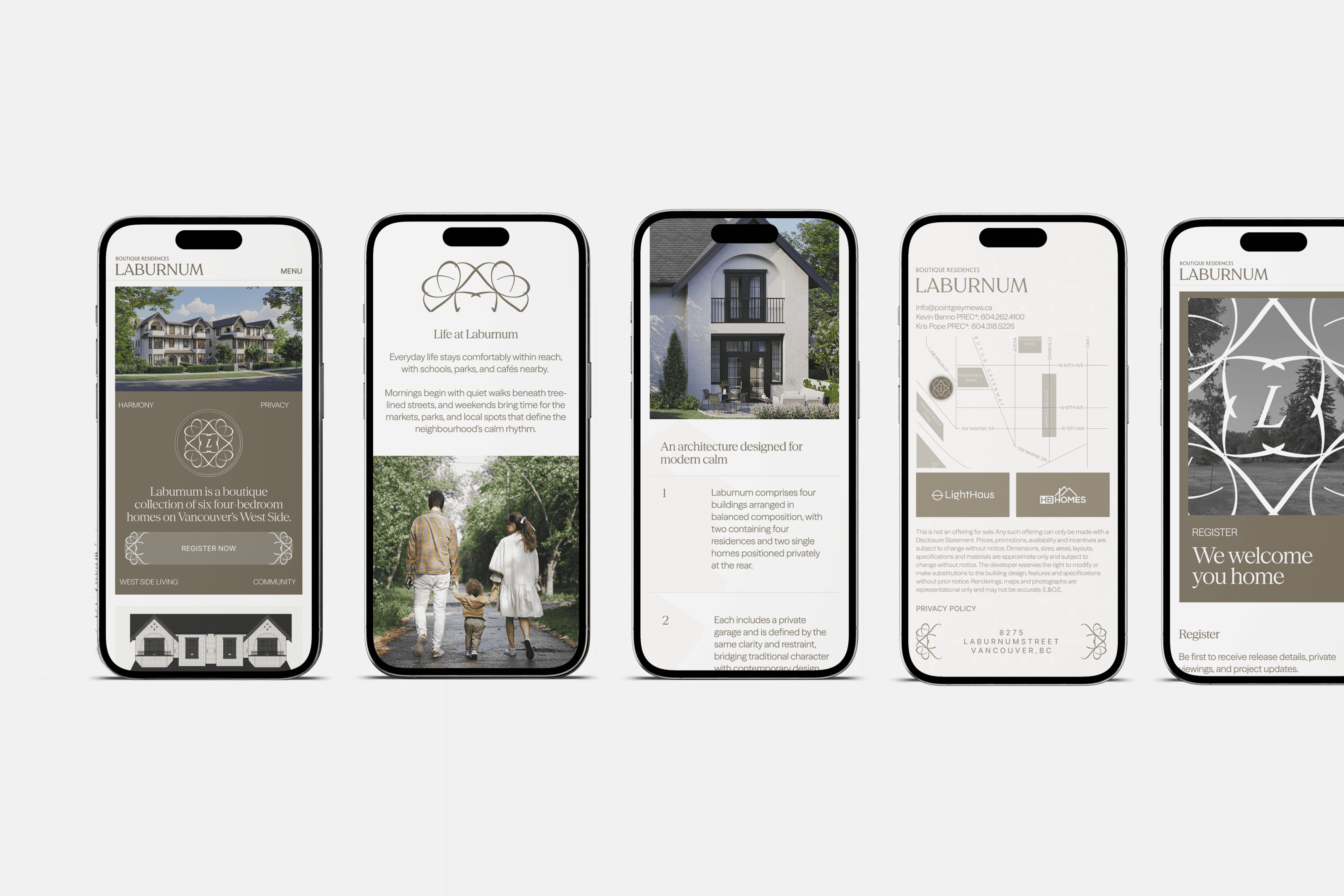
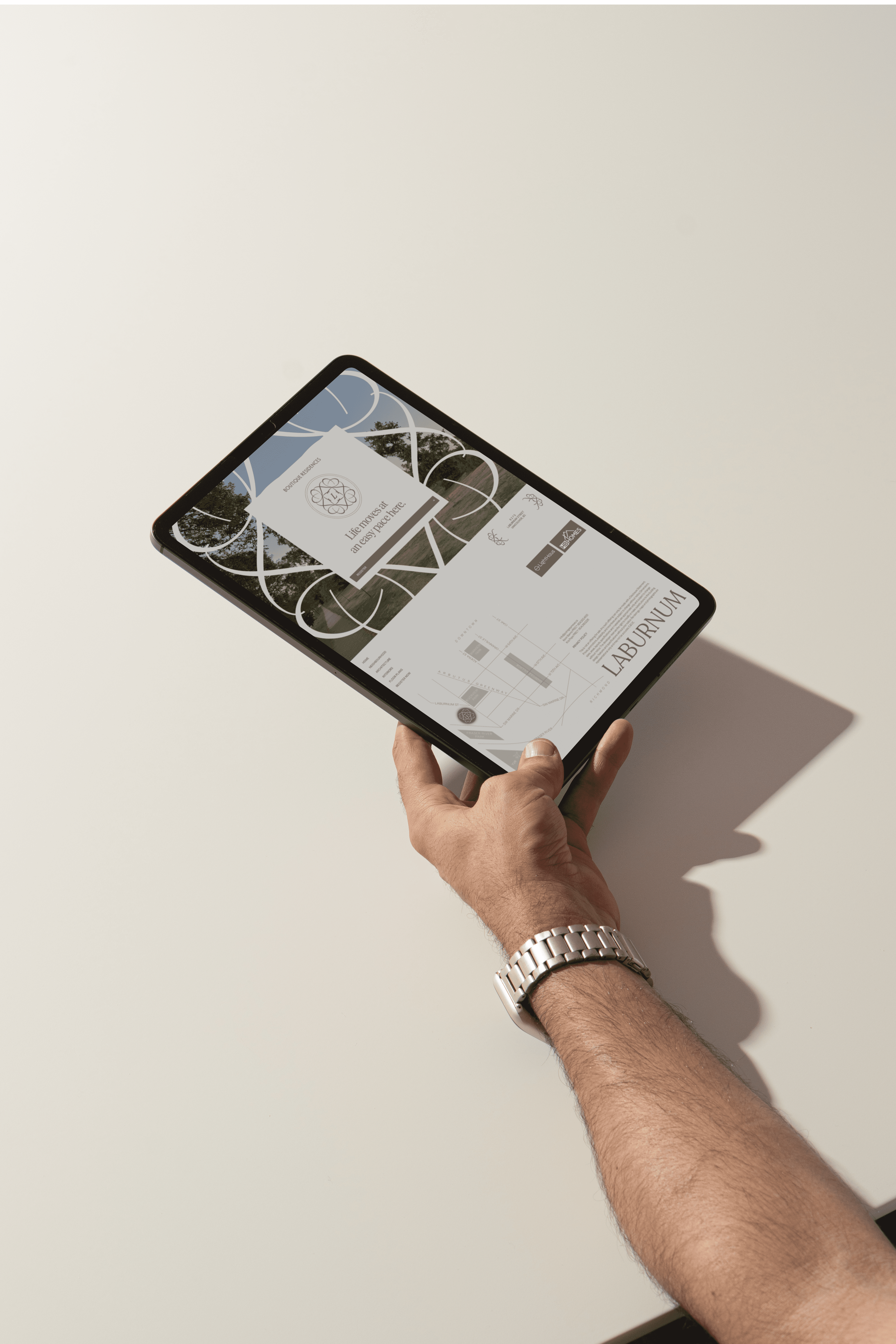
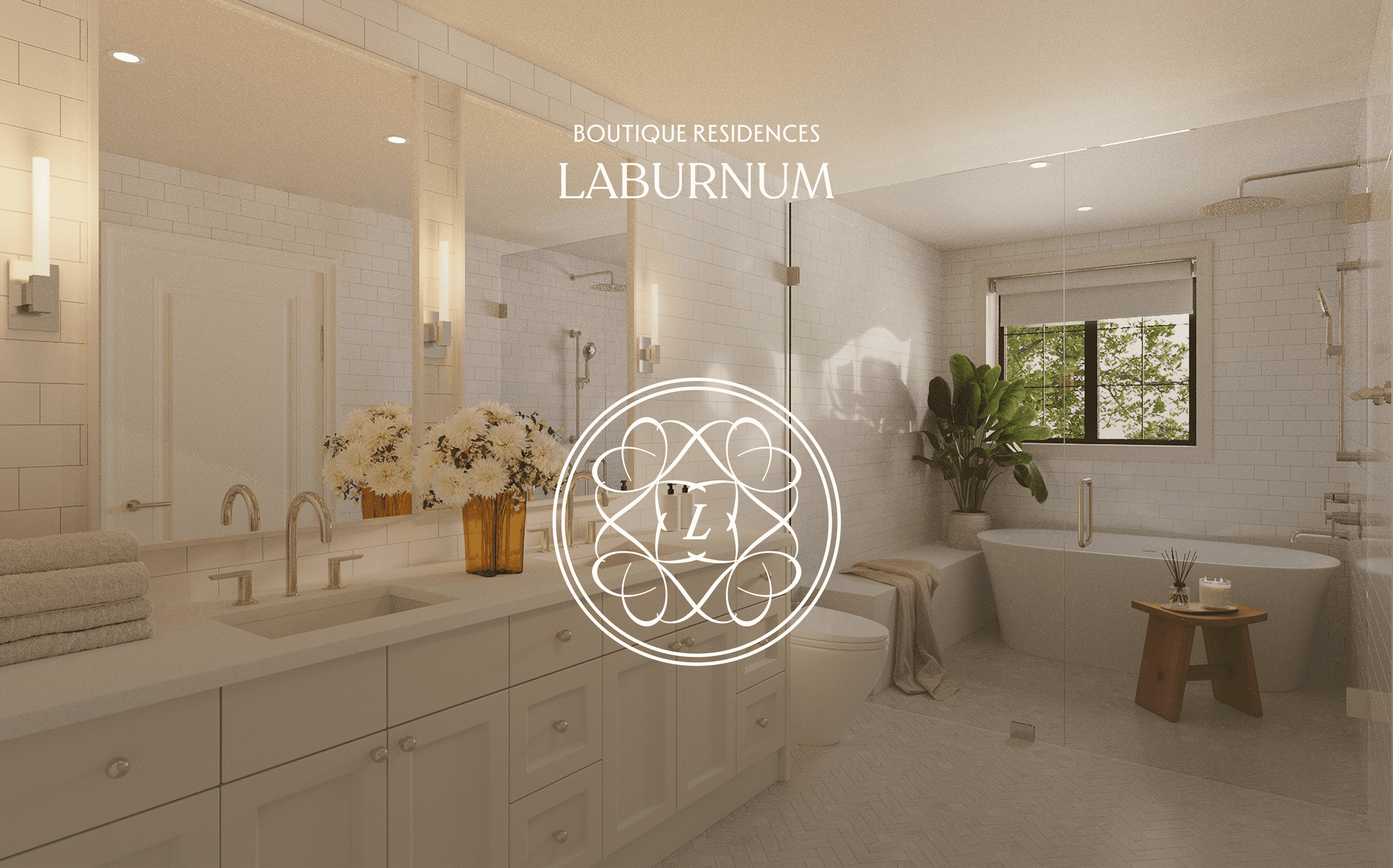
A website experience that translates architectural thoughtfulness into digital interaction—where each scroll, transition, and content hierarchy reinforces the "designed to belong" narrative.
Market Differentiation:
In a landscape of large-scale developments, the brand centers human proportion, emotional authenticity, and architectural craft—creating space for diverse family structures to envision ownership while maintaining investment sophistication.
Brand Positioning:
Six rare four-bedroom homes in Marpole's heart—designed for family-centered living, boutique intimacy, and West Side connectivity.
Visual Identity:
The interlocking "L" mark serves as both rational signifier (four bedrooms) and emotional anchor (family connection), creating a symbol that operates across cultural contexts while maintaining premium aesthetic standards.
Digital Presence:
A website experience that translates architectural thoughtfulness into digital interaction—where each scroll, transition, and content hierarchy reinforces the "designed to belong" narrative.
Market Differentiation:
In a landscape of large-scale developments, the brand centers human proportion, emotional authenticity, and architectural craft—creating space for diverse family structures to envision ownership while maintaining investment sophistication.