Website Design
Brand Identity
K-Soft
Software Development Services
Deliverables:
Website Design
Website Design
Brand Identity
Brand Identity
Creative Direction
Creative Direction
Recognition:
Winner of the 2025 Silver A' Design Award in Website and Web Design.
From the client:
K-Soft needed a clear, confident brand presence that reflected its 8+ years of software expertise while appealing to startups, mid-size companies, and enterprises seeking modernization.
The goal was to position K-Soft as a reliable long-term technology partner—not just a service provider—by communicating trust, innovation, and technical depth through a strong visual and digital identity.
The process began with an in-depth discovery phase to understand K-Soft’s values, vision, and inspirations. During this phase, the client referenced Microsoft and Tesla as brands they admire—highlighting a balance between established technological credibility and bold, future-oriented ambition.
The creative direction drew inspiration from:
The inner structure of cables, symbolizing the unseen systems behind software and technology
The futuristic optimism of 1980s tech, particularly early Microsoft
The confidence and forward momentum associated with SpaceX
This approach allowed the brand to feel both grounded in experience and excited about the future.
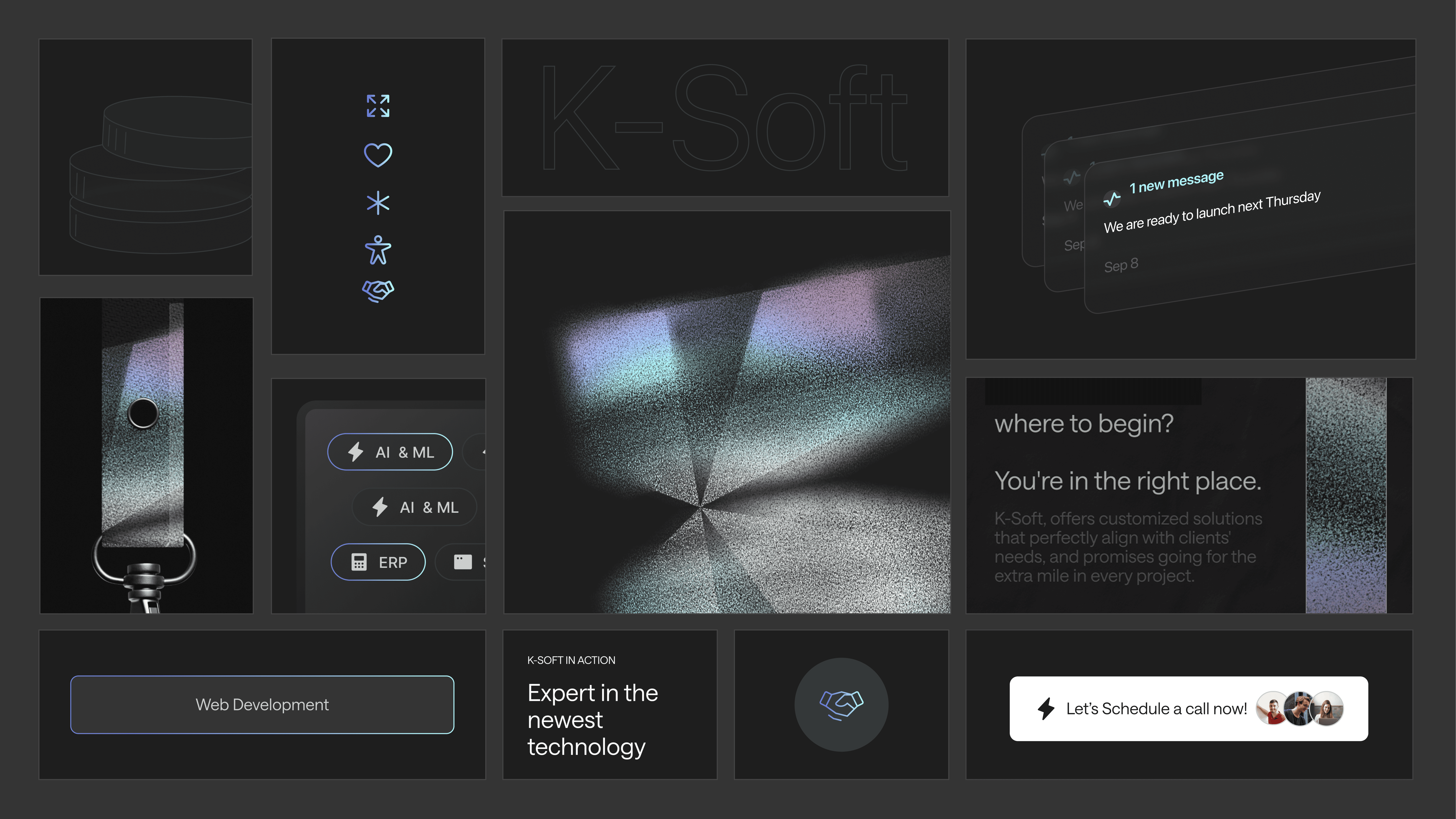
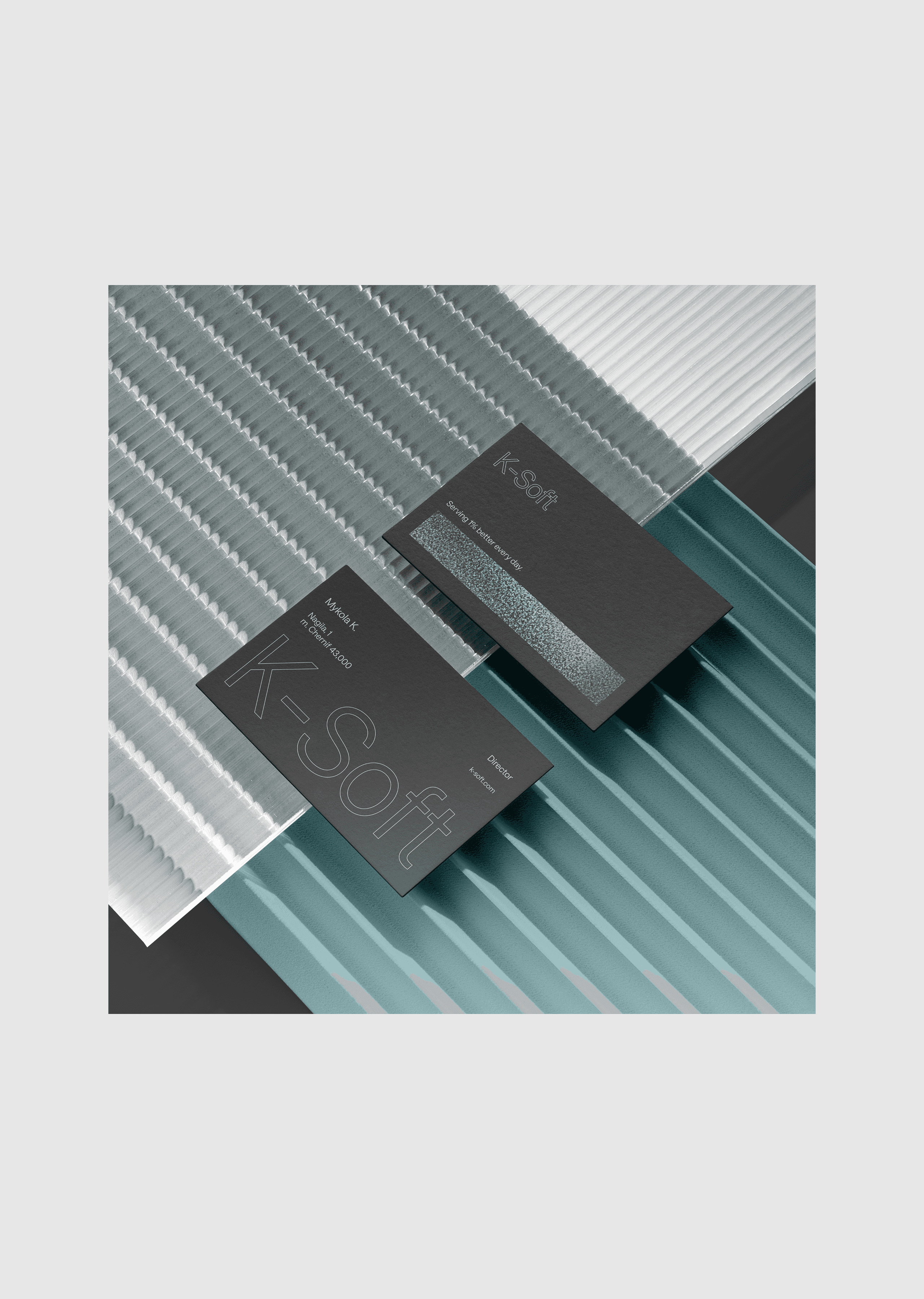
The resulting brand identity centers around a custom “K” lettermark, inspired by the inner mechanics of a cable—representing the physics, logic, and precision behind software development. The visual language combines technical clarity with a subtle retro-futuristic tone, reinforcing K-Soft’s expertise while projecting confidence and innovation.
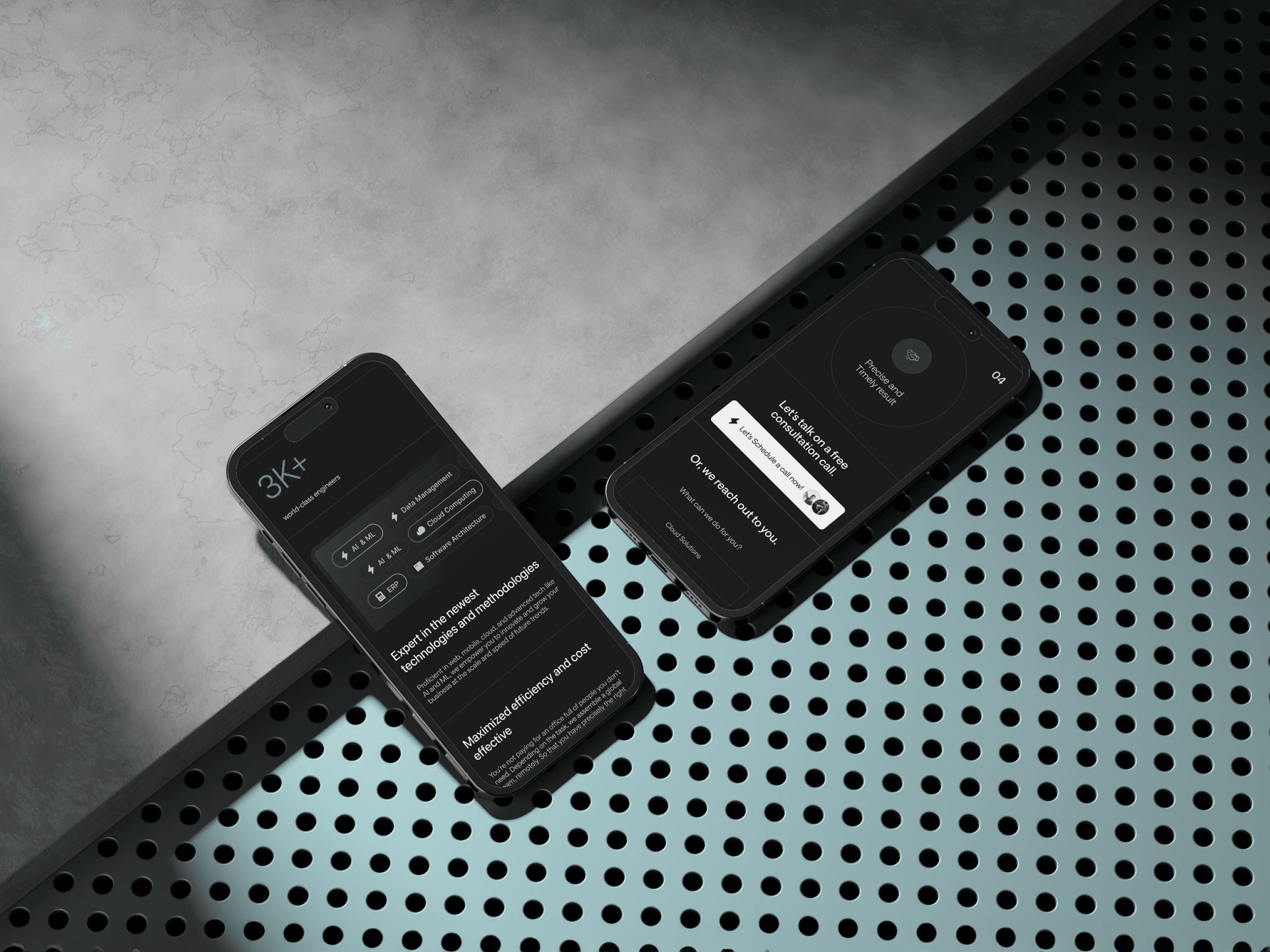
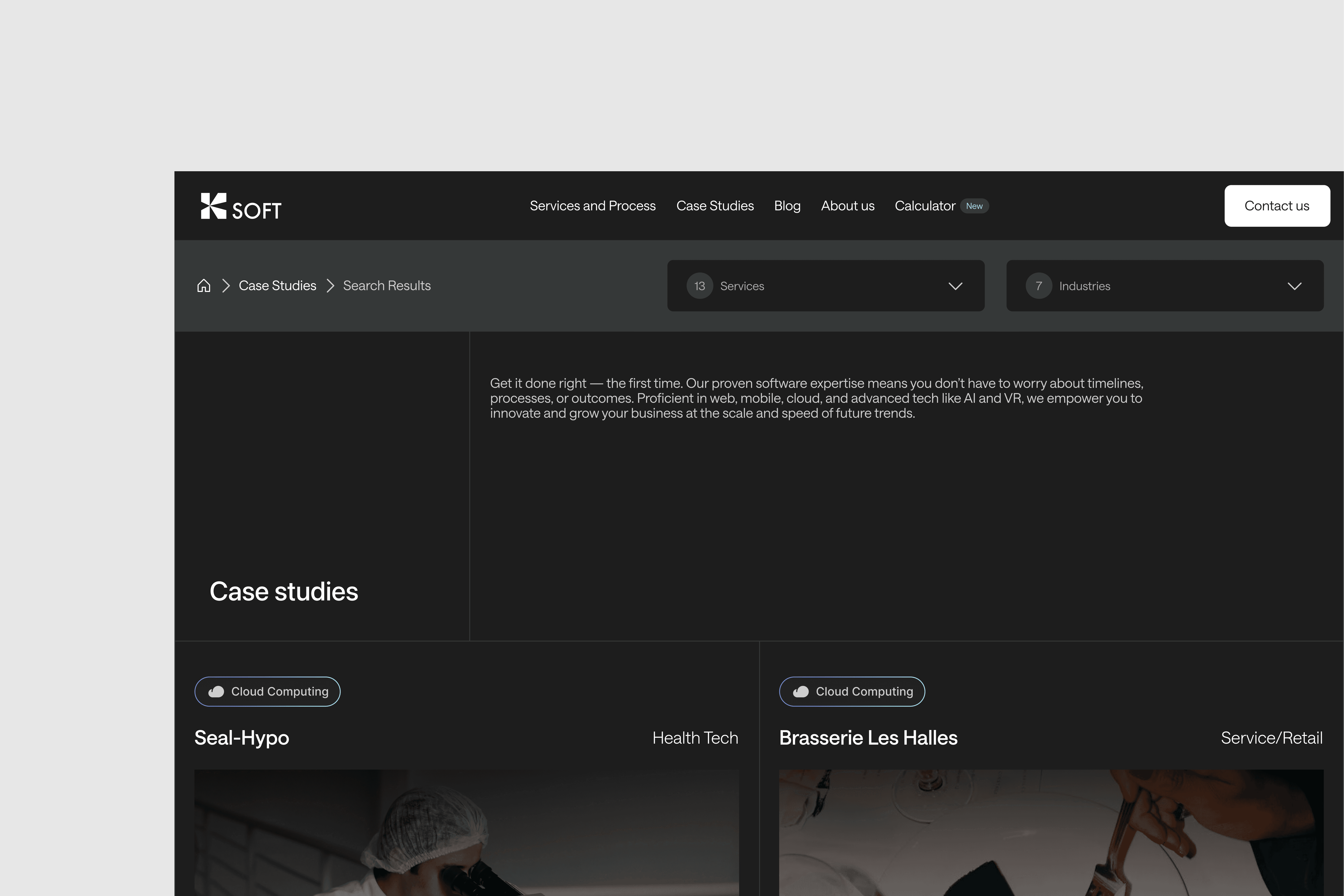
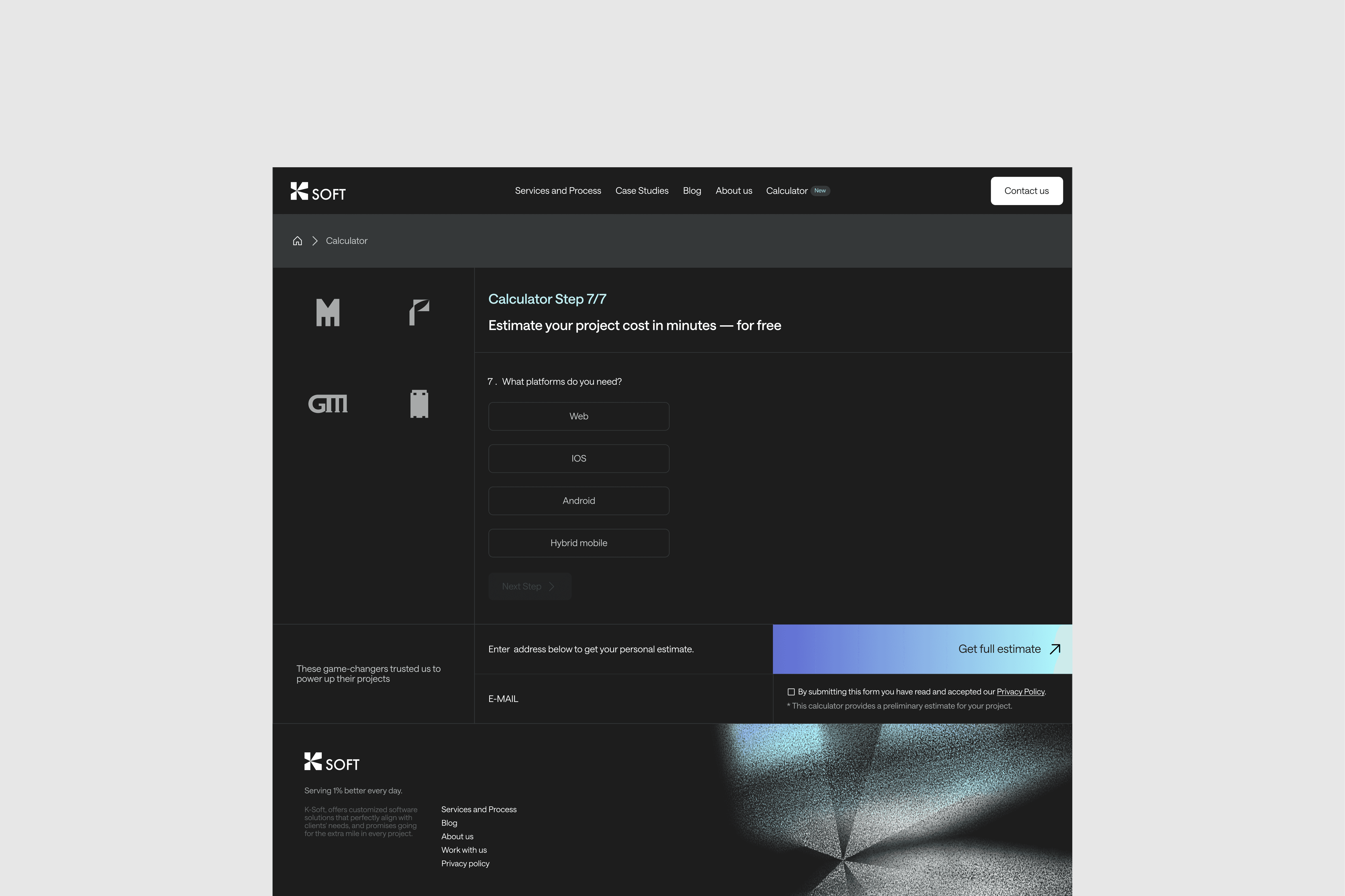
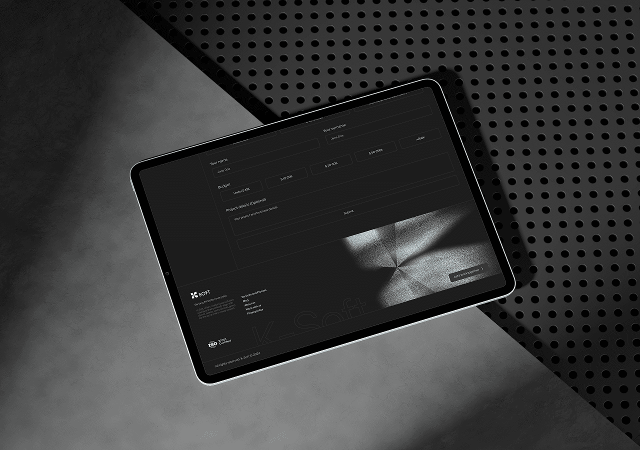
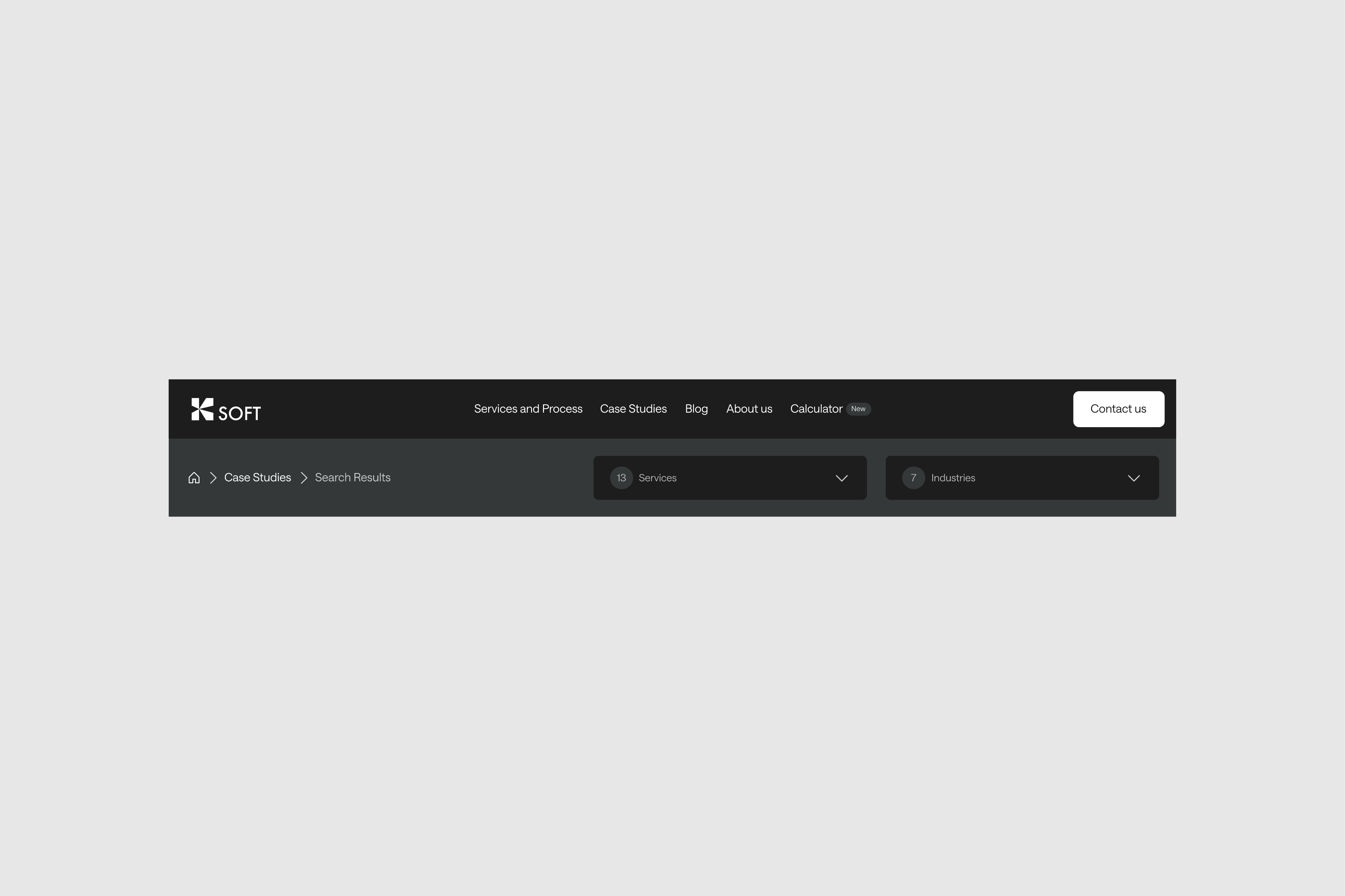
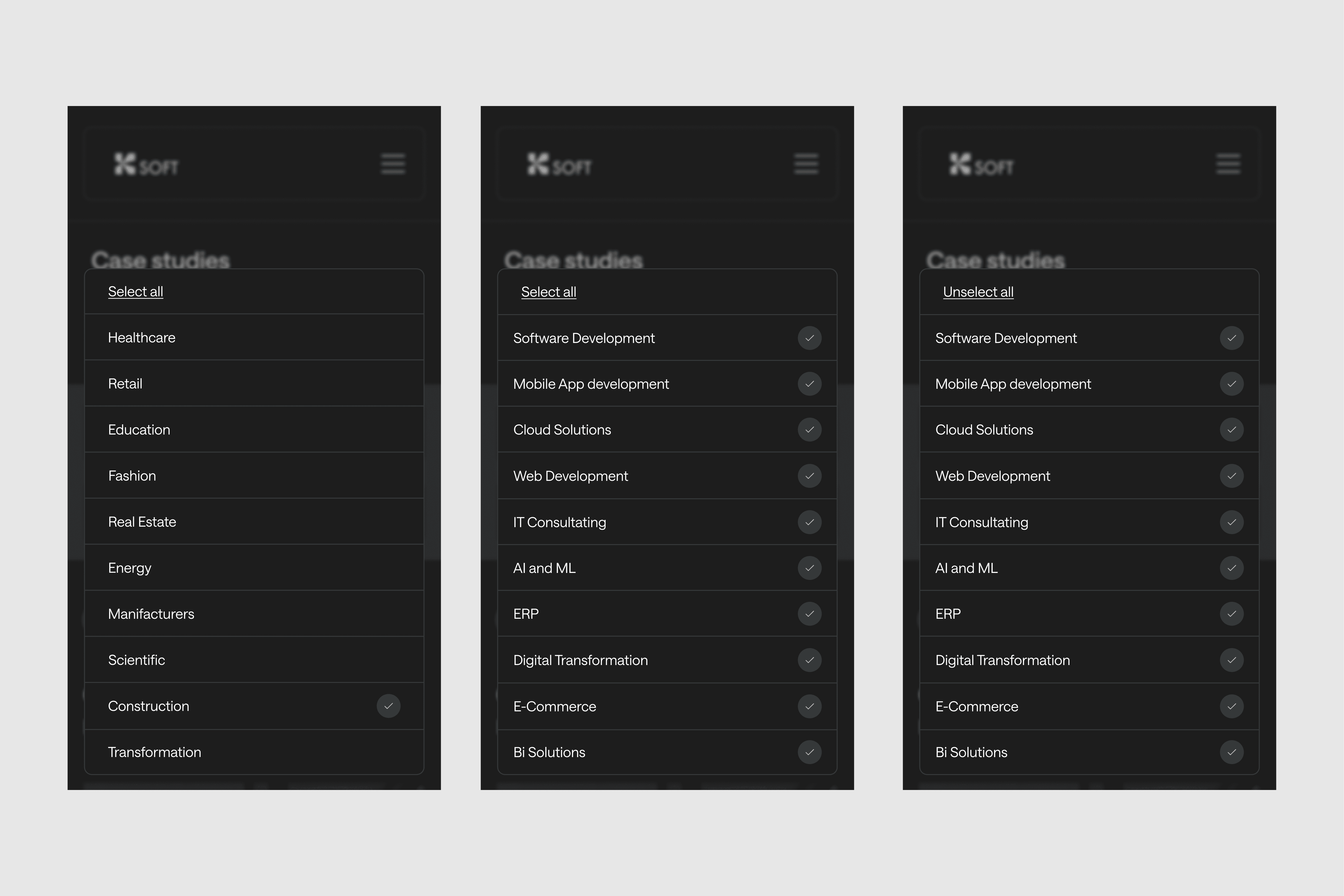
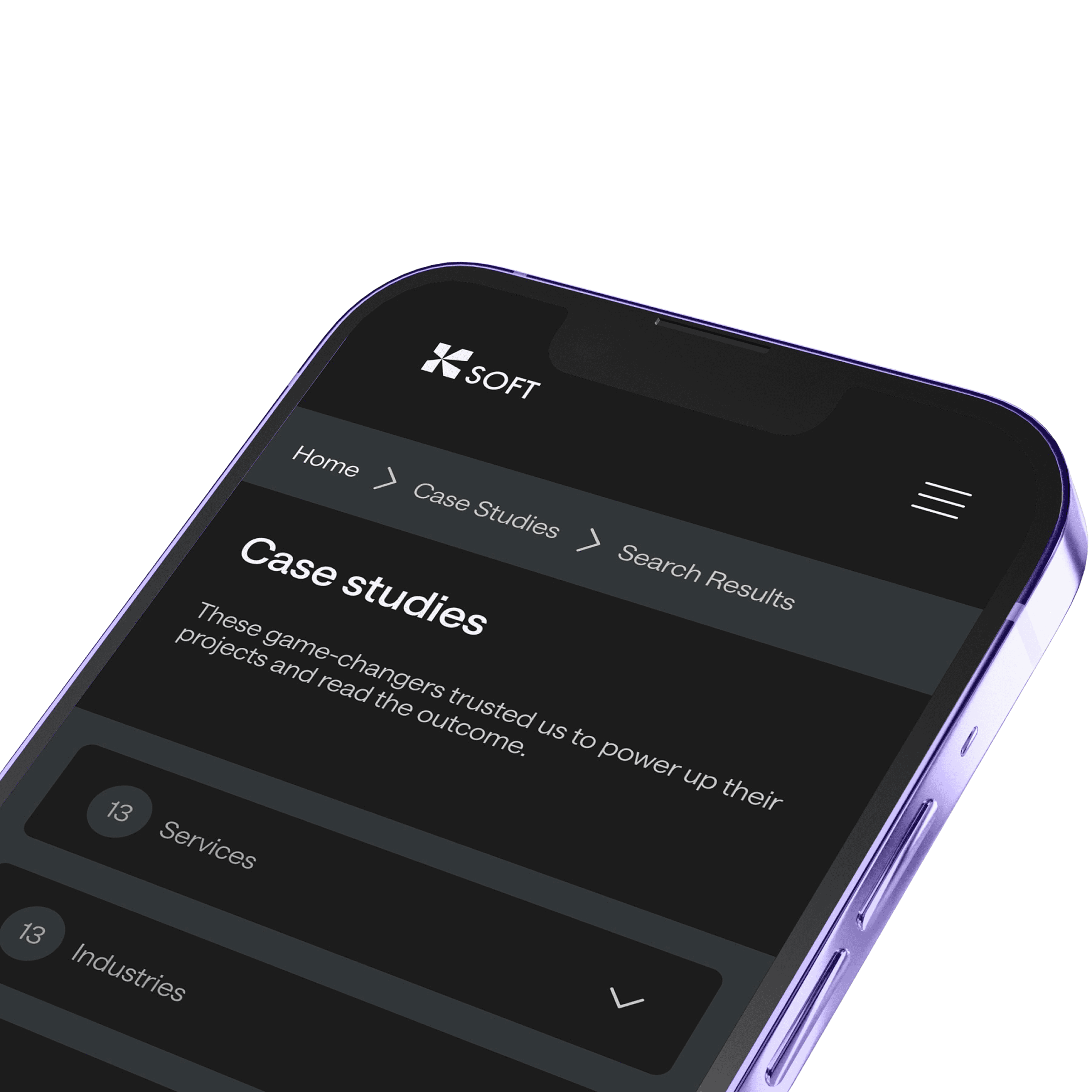
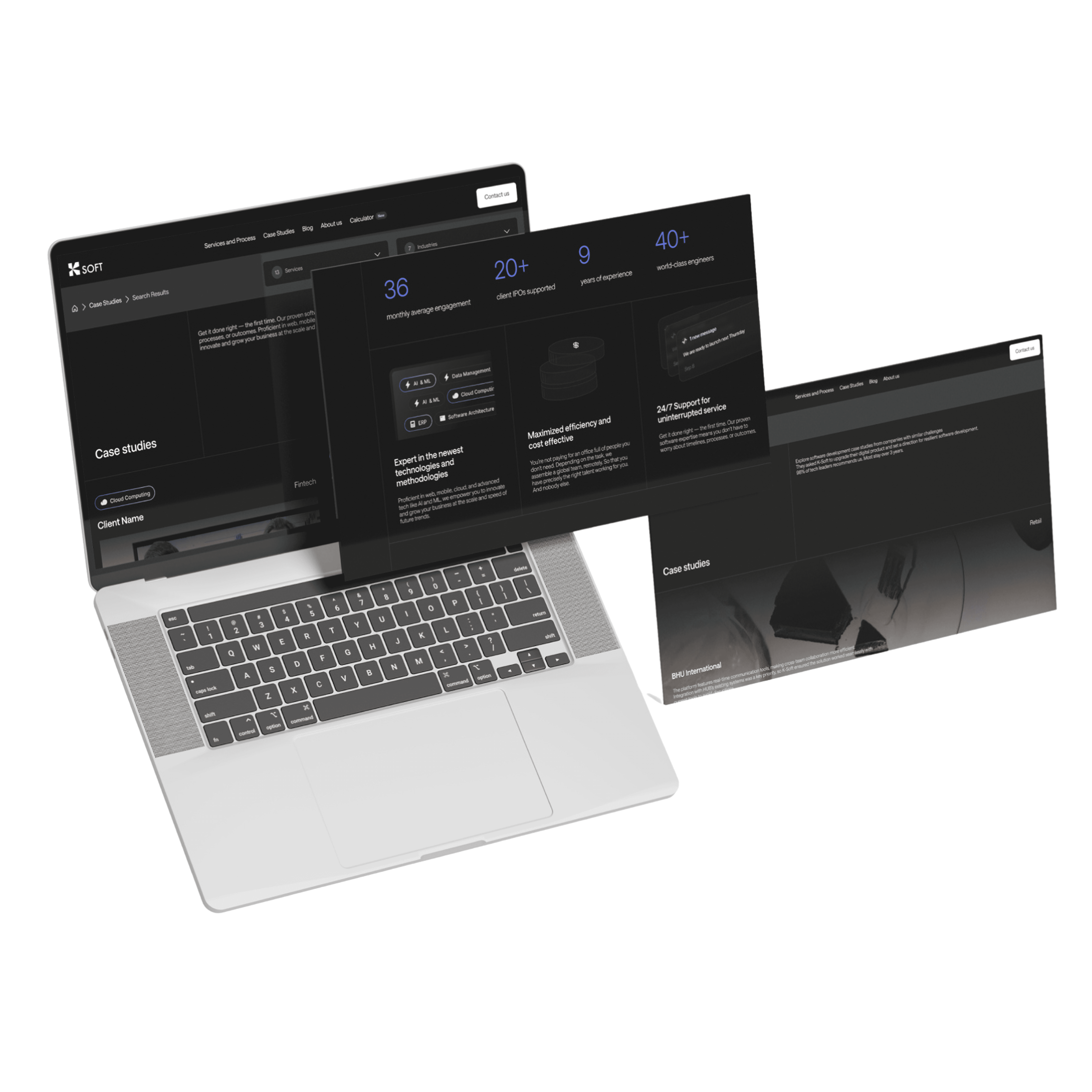
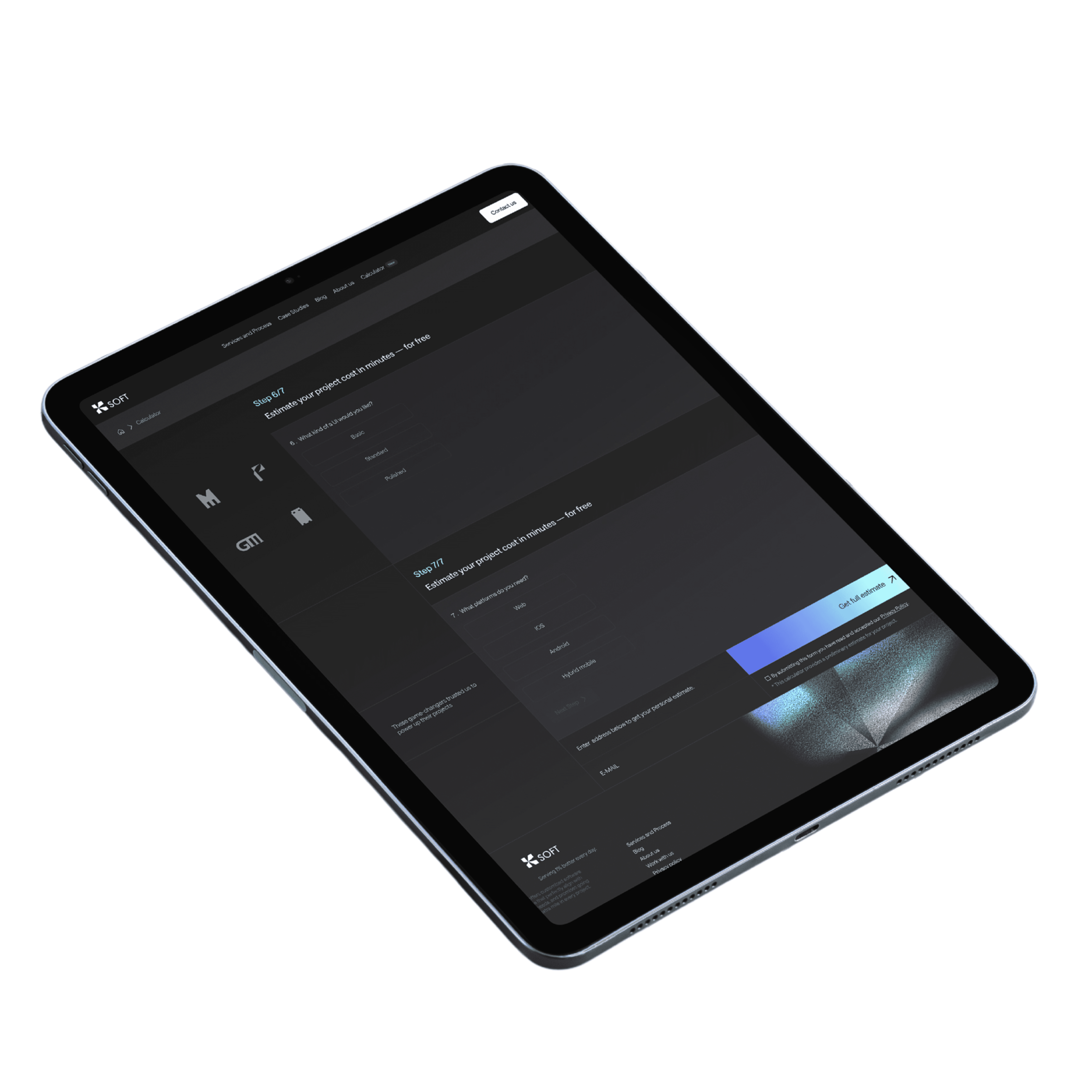
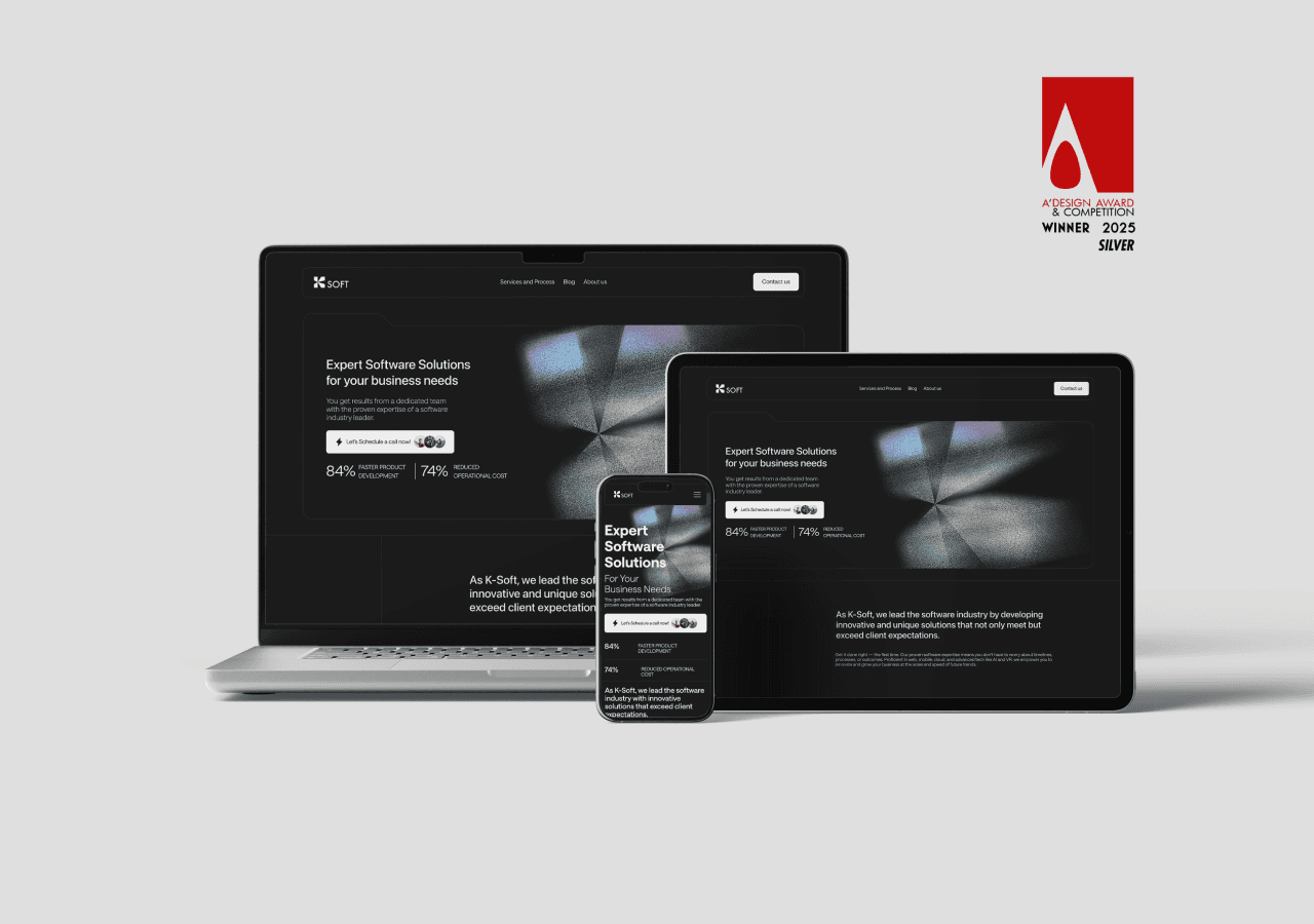
The brand system was extended into a conversion-focused landing page, designed to communicate clarity, trust, and capability at first glance supporting K-Soft’s commitment to clear communication, dependable delivery, and client-centric collaboration.
The resulting brand identity centers around a custom “K” lettermark, inspired by the inner mechanics of a cable—representing the physics, logic, and precision behind software development. The visual language combines technical clarity with a subtle retro-futuristic tone, reinforcing K-Soft’s expertise while projecting confidence and innovation.
The brand system was extended into a conversion-focused landing page, designed to communicate clarity, trust, and capability at first glance supporting K-Soft’s commitment to clear communication, dependable delivery, and client-centric collaboration.